 UI Redesign
Following feedback from our customers we’ve moved our platform to a more modern design focusing on some key areas: accessibility, scannability, and introducing a modern look and feel that users are more familiar with. We now have cleaner calls to action and pages with scannable hierarchy to help relieve decision fatigue.
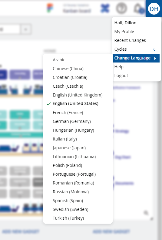
Change Languages
The quick language change was relocated to the profile dropdown menu. As a Designer or Architect you can quickly change between more than one language, it will populate the languages available. This does not change the UI language, only the content language.
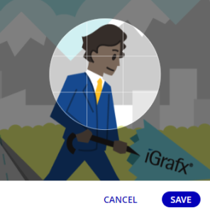
Profile Area
The Profile area now includes a profile image editor. By default, your icon displays your initials. The design of the profile area and its tabs have been updated.
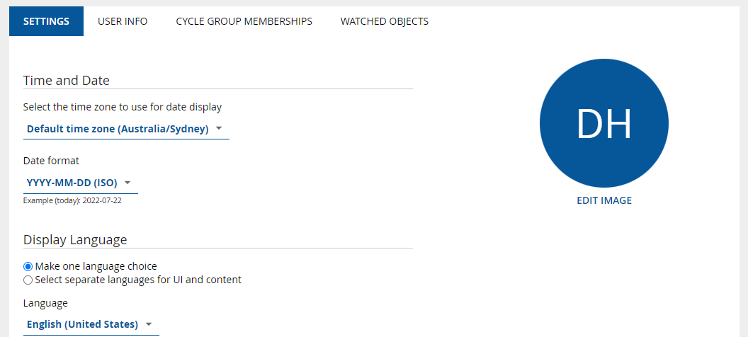
Instructions for editing your profile image...
-
Click your icon in the redesigned top menu

-
Click My Profile
-
Under the Settings tab, click Edit Image
-
Upload an image file you would like to use
-
Position your image in the image frame, scroll up or down in the frame to adjust zoom.
-
Click Save
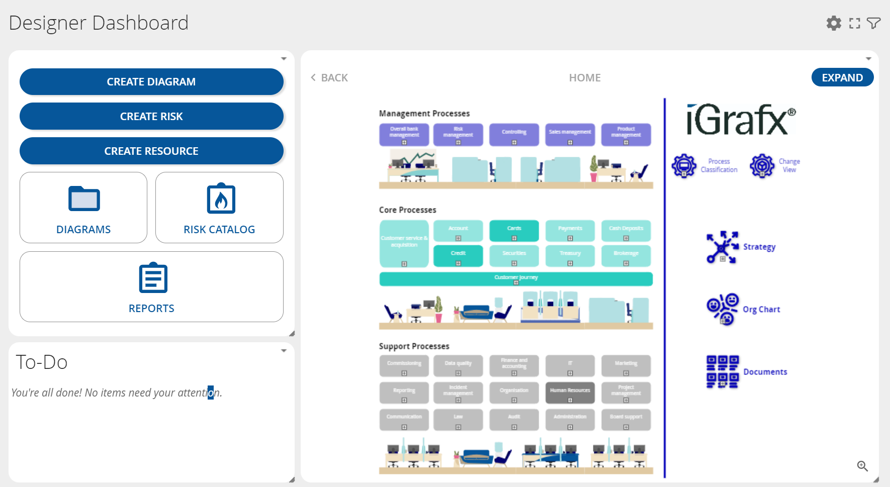
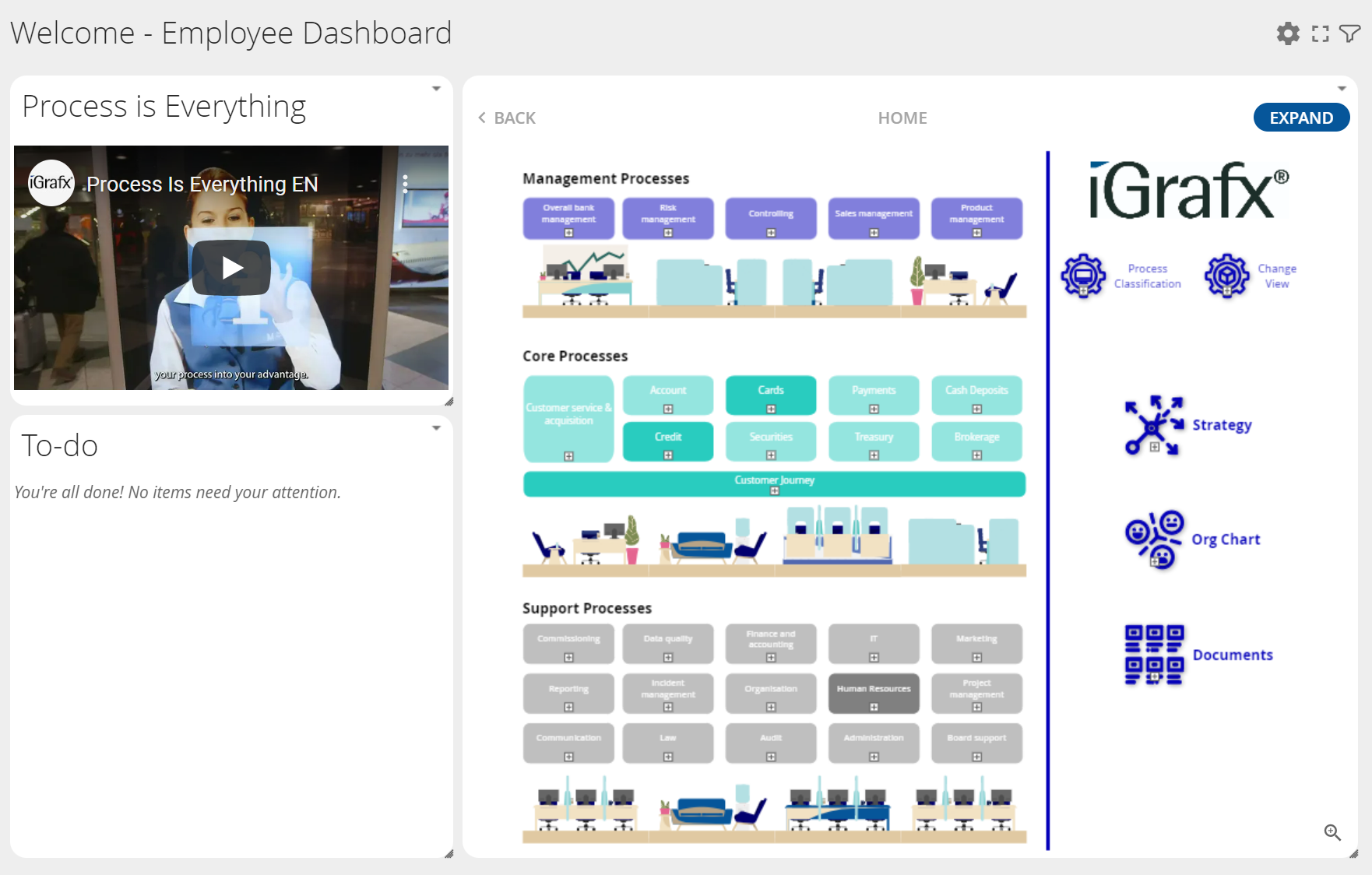
Dashboard
The Dashboard area has been redesigned for accessibility and ease of use. Gadgets and their buttons look and feel more modern.
Tree
The design of the Tree, its resizing controls, and the icons of its contents have been adjusted for clarity, accessibility, and alignment with the repository theme.
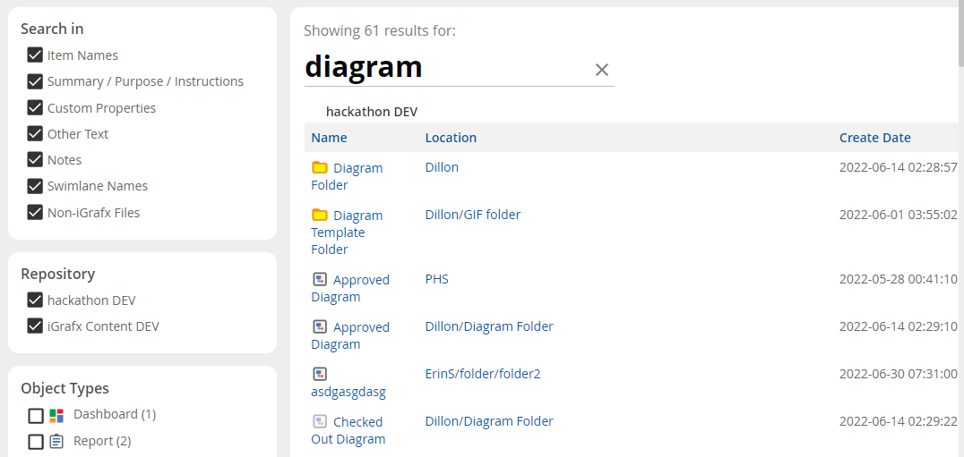
Search
Search has an improved design to make finding content more accessible and fast. The layout of the Quick Search results has been adjusted for simplicity and ease of use.
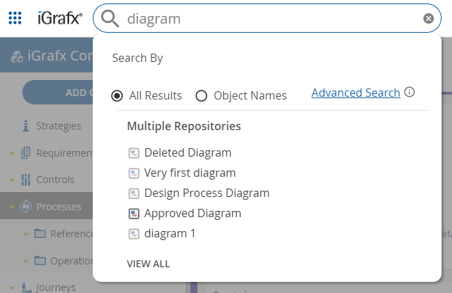
Clicking View All in the search takes you to the updated results page. Filter groups, the results list, and the search field are now more distinct and legible.
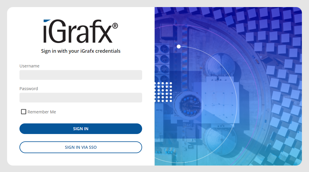
Login And Logout
The modern visual update also applies to the login and logout experience.
 Diagrams
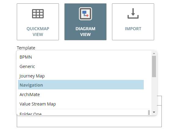
Navigation Template
New diagram template available! Create maps where the whole shape is clickable when there is a link on the object. When clicking anywhere on a shape with more than one link, the links panel opens as if you clicked on the link icon. If the shape is a call activity, it treats the entire shape as a clickable area to navigate to the called activity. This makes it easy for users to explore your organization and its various content areas and processes. This functionality is available on Dashboards using the diagram gadget, and is now also available in the Model area.
Instructions for accessing navigation template...
How to create a navigational diagram
-
Find a suitable folder and click Add Object
-
The Template menu now has a Navigation option
-
Fill out supporting details and click Finish
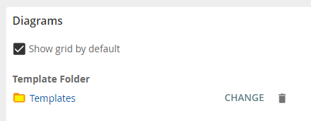
Diagram Grid Default
Diagram grids can now be turned on or off by default.
Instructions for adjusting diagram grid defaults...
How to adjust diagram grid defaults
-
Open the Main Menu
-
Open the Repository Configuration submenu
-
Click Advanced
-
Under Diagrams, there is a new "Show grid by default" checkbox
 Dashboard Gadgets
Navigational Diagram Gadget
A convenient way to route employees to the repository content they need. The diagram gadget no longer requires an approved version.
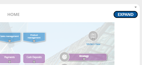
Expand Diagram
The Open button on the diagram gadget is renamed to Expand for a better user experience. Functionality is the same; open gadget diagrams into the diagram area for more in-depth, fully-featured browsing. The button label is an adjustable UI component (property name: expand_diagram_gadget_button). To learn more, review our Customizing the iGrafx Platform's Appearance document, or reach out to iGrafx Customer Success.
Quickstart Gadget
Configure the Quickstart gadget buttons to speed up the object creation process. Give users quick and easy access to diagram and enterprise object folders from the Dashboard area.
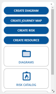
Instructions for configuring Quickstart gadget...
-
Access the Dashboard area
-
Click Add New Gadget
-
In the resulting blank gadget, click Configure Now
-
You can toggle the Create buttons you prefer
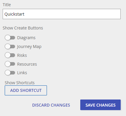
-
You can also include shortcuts to any folder, enterprise object, diagram, or external file you prefer
-
When you are finished, click Save Changes
Dashboard Select
The dashboard selection menu is now available in the Dashboard area, as well as the settings icon.
 Permanent Deletion
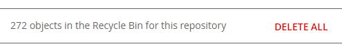
Items moved to the Recycle Bin can now be permanently purged from the repository. Users with the 'View All Deleted Objects' repository permission can delete ALL objects in the Recycle Bin to permanently remove those objects.
Instructions for purging deleted items...
-
Open the Main Menu
-
Click Recycle Bin
-
Above the object list there is a total count and the option to DELETE ALL
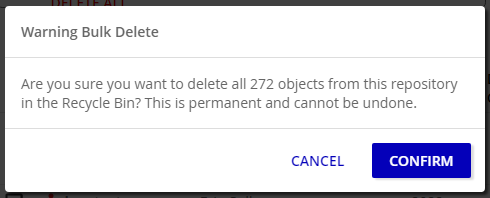
-
Your are given the chance to CONFIRM your decision. Deletion cannot be undone.
-
The platform may take a few moments to process the deletion
-
The Recycle Bin is now empty
Click here to read more about the Recycle Bin
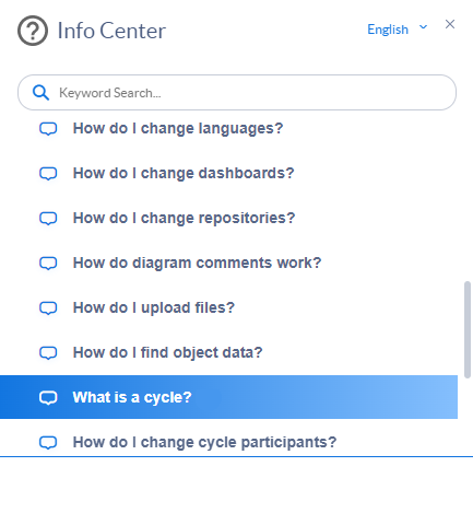
 Info Center
The Info Center has 11 new walkthroughs for a variety of fundamental features geared toward making onboarding new users more efficient. All guides have been redesigned to function even better with the new UI design.