 UX Improvements
Dashboard Area
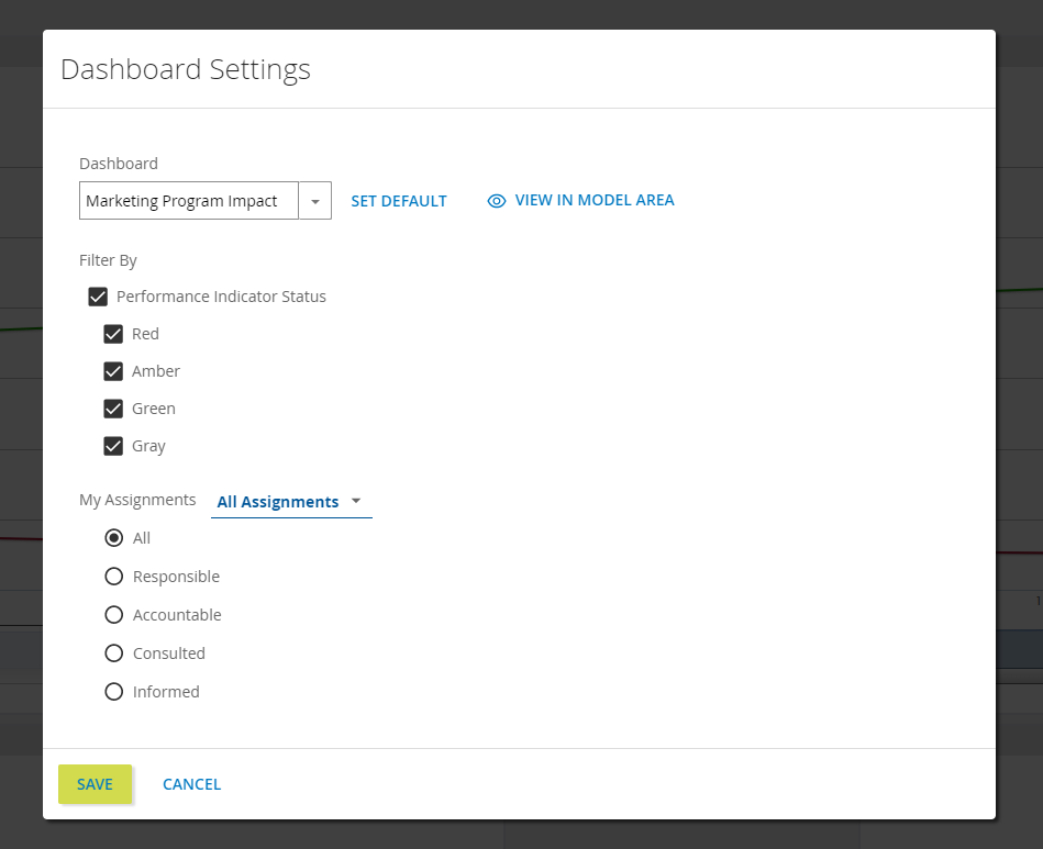
The new Dashboard area layout leaves more room for your gadgets and other dashboard contents by organizing the settings and options into a convenient group in the top-right. The new gear icon reveals the dashboard selection menu and Filter By settings, and the new My Assignments settings. The fullscreen and filter toggles' behavior has not changed.
Instructions for the new gear icon...
To use the new gear icon in the Dashboard area, do the following:
-
Navigate to the Dashboard area via the Main Menu
-
Click the new gear icon in the top-right to open the Dashboard Settings modal
-
Here you will find the following:
-
Dashboard: selection menu for dashboards in your repository behaves the same as the menu in the previous Dashboard area layout.
-
Filter By: performance indicator filters that behave the same as before. Clicking the filter icon in the Dashboard area will toggle these settings.
-
My Assignments: new functionality that reveals repository content in the Dashboard area based on RACI assignments.
-
-
After making your selections, click SAVE to apply changes and close the modal.
 Web Diagramming
Default font sizing
A default font size can be selected so that every label and annotation added to a diagram will be uniformly sized. You can set a default in template diagrams for further uniformity.
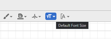
Instructions to set a default font size...
To set a default font size:
-
Navigate to a checked-out diagram
-
Make sure no diagram elements are selected
-
Click the new Default Font Size icon in the top menu
-
Make your font size selection
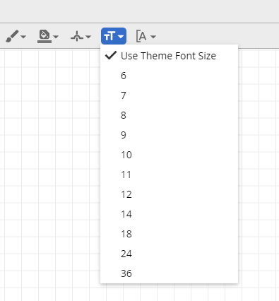
-
Any new label or annotation added to the diagram will match the selected default font size. Note: setting a new default will not change existing labels or annotations.
Line spacing
The spacing between lines of text in a diagram can now be adjusted. Like many text editing programs, space between lines can be set incrementally from 1 to 2 line heights.
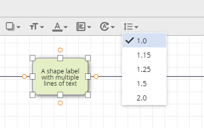
Instructions to adjust line spacing...
To adjust line spacing:
-
Navigate to a checked-out diagram
-
Select a diagram element with a label or annotation
-
Click the new Line Spacing icon in the top menu
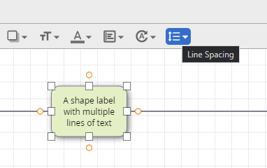
-
Make your line spacing selection. Note: line spacing is not defaultable like font size.
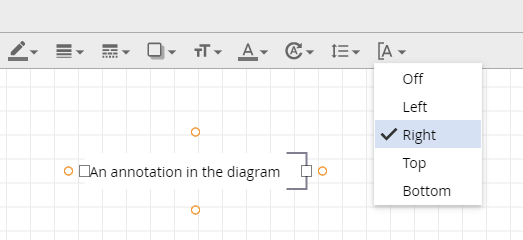
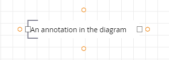
Text Bracket control
The position of brackets on text annotations can now be adjusted. While BPMN diagrams tend to have brackets to the left of the annotation, we now offer more flexibility. Brackets can be adjusted for individual annotations, or a diagram-wide default can be set.
Instructions to adjust existing annotation brackets...
To adjust existing annotation brackets:
-
Navigate to a checked-out diagram
-
Select an existing annotation
-
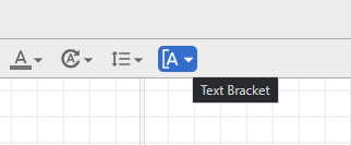
Click the new Text Bracket icon in the top menu
-
Make your text bracket position selection.
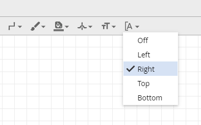
Instructions to annotation bracket defaults...
To select an annotation bracket default:
-
Navigate to a checked-out diagram
-
Make sure no diagram elements are selected
-
Click the new Text Bracket icon in the top menu
-
Make your bracket position selection
-
Any new annotation added to the diagram will be bracketed based on your selection. Note: setting a new default will not change existing annotation brackets.
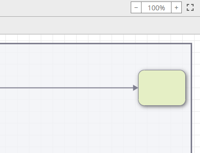
Pan while dragging
Elements in a diagram can be clicked and dragged to the edge of the canvas to pan your view of the diagram. This allows for the intuitive movement of shapes across the full area of larger process maps.
Instructions to click and drag to pan...
How to click and drag to pan:
-
Navigate to a checked-out diagram
-
Click and drag an element to move it
-
Drag the element to the edge of the canvas, as if to take it off-screen.
-
Observe how your view of the diagram canvas moves. Note: this works in all directions around the canvas and with all diagram elements.
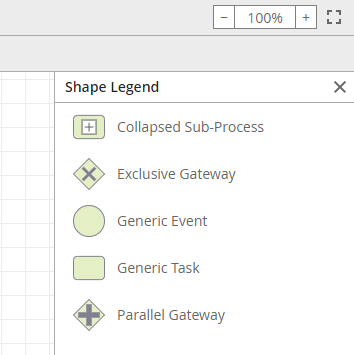
Improved Shape Legend organization
The Shape Legend is a helpful reference for the different types of shapes found in a diagram. When multiple similar shapes are present, the legend consolidates them in a more organized list.
Instructions to access the Shape Legend...
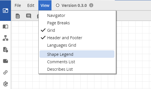
How to access the Shape Legend:
-
Access any process diagram (checked-in or checked-out)
-
Go to the View menu and click Shape Legend
-
This opens the newly-organized Shape Legend to the right of the diagram canvas
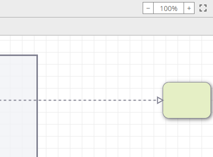
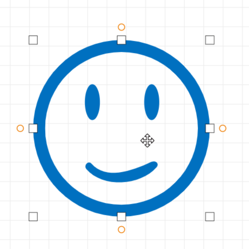
Improved shape selection behavior
Shapes with transparent, or hollow, areas are now easier to click so long as the shape is fully closed, like the complete circle in the example below. You can click anywhere within a shape's total area to select it, rather than having to select a stroke or filled area. Users will still have to select a stroke or filled area if the hollow area is not fully enclosed.
 Dashboard Gadget
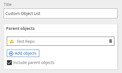
Custom Object List Gadget
Now provides a checkbox to include or exclude parent objects of items in your list. This new box is checked by default so it is compatible with the previous list behavior but can be unchecked at any time.
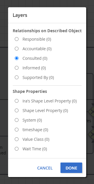
 Layers
The Layers modal now offers Described Object RACI options to expose, support for Custom Properties with multiple lines of text and Rich Text elements, and consolidated entires for hidden and deleted custom property Relationships.