Create a chart
Add a Chart object that visualizes the data of one or more Performance Indicators, and configure its series, legend, and axes.
Prerequisites
- The PRC (Performance, Risk and Control) Module, and a license that can create and edit Charts and Tables — see the License capability matrix.
- At least one Performance Indicator with numeric data to chart — see Add performance indicator data.
Steps
Add the Chart object
- In the repository tree, select the folder or object where the chart belongs. You can create a Chart in most places except the Risk Catalog.
- Click Add object, choose Chart, type a Name, and click Finish.
Add Performance Indicators
- On the chart's Chart tab, click Edit Chart.
- On the Performance Indicator tab of the editor, click Add Performance Indicator.
- In the Choose Objects dialog, search by name or turn on Show Tree, pick the indicators, and click Confirm selection.
- Each indicator becomes a row in the editor, with its data type, its rating system, a Color picker for the series, and controls to delete it or reorder it.
Configure the chart
Changes in the editor apply as you make them; click OK when you're done.
- Select an indicator's name to configure its series. On its Display tab, choose Display as (Line, Spline, Bar, Area, Area spline, Pie, or Gauge), stacking, Date grouping (group points into daily through yearly buckets — the grouping applies to every indicator in the chart), Value grouping (how grouped points condense: Average, Open, High, Low, Close, or Sum), rounding, the axes the series plots on, and what shows in tooltips and the legend.
- The series' Limits and Target tabs plot the indicator's limit ranges and target line alongside the values — as a step or area, with optional legend entries and future values.
- The editor's Display tab holds chart-wide options: the zoom and time-range controls, how much history to show, the background color, an auto-refresh interval, and two special renderings — a polar (round or spiderweb) layout, and a geospatial map for indicators that carry a location.
- The Legend and Axes tabs control the legend's placement and the axes. Add axis creates a new left, right, top, or bottom axis, Delete axis removes one, and each series picks the axes it plots on from its Display tab. Select an axis to configure it: the Axis type (Linear, Date/Time, or Logarithmic), the Scale (Auto adjust or a fixed Min./Max., with Snap zero to keep zero in view), the Tick size and Date format of a date axis, the label alignment and angle, and the grid line width. Under Compare settings, Compare date data splits a date series into one overlaid series per period (Day to Year) so you can compare periods against each other.
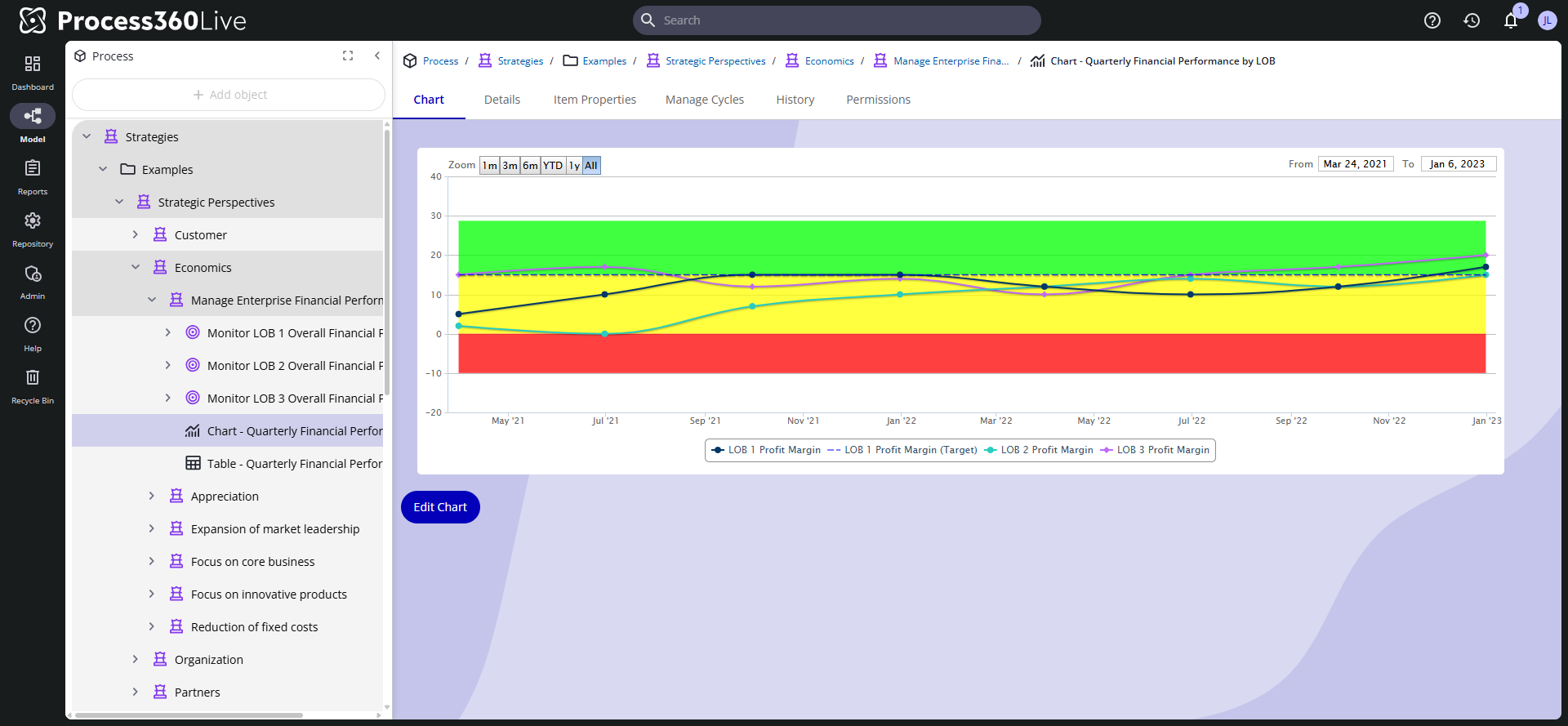
A Performance Indicator's own Chart tab has the same Edit Chart editor, limited to that one indicator. Use a Chart object when you want several indicators in one picture, or want to show the chart on a dashboardDashboard A configurable view in Process360 Live that aggregates KPIs, charts, and filters across one or more processes for stakeholders to monitor performance. or in a Performance Tree.
Comment on the chart
Click any data point to open the Comments dialog. It carries two kinds of comments, on separate tabs:
- Add to performance indicator — a comment on the indicator's data, pre-filled with the series and date you clicked. It belongs to the indicator and shows on every chart that plots it — see Comment on a data point.
- Add to chart — a comment on the chart itself, tied to a date — or to the whole chart if you leave the date empty — independent of any indicator; use it, for example, to mark an event that affects every series. These comments belong to this Chart object only, so the two chart tabs don't appear on a Performance Indicator's own Chart tab — nor when every indicator in the chart displays as a pie.
Indicator comments show as numbered flags pinned to their series; chart comments show as numbered flags on the date axis. Pointing at a flag shows the author and text. The Comments on performance indicator and Comments on chart tabs list the existing comments, with Delete if you can modify the indicator or the chart.
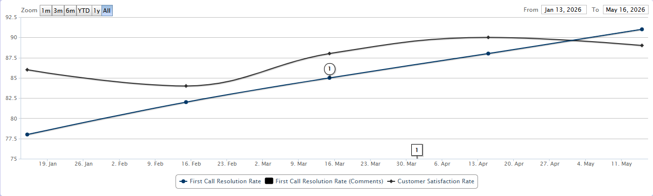
Adding a comment requires the Add Diagram Comments item permission — on the indicator for indicator comments, on the chart for chart comments.
Three editor settings control the display, all on by default: each indicator's Comment indicator (the flag on its series) and Show comments in legend options on the indicator's series settings, and the chart-wide Show chart comments option on the editor's Display tab (the axis flags from chart comments).
Verify
Open the chart's Chart tab. The series render with the zoom presets (1m to All) above the plot. A chart with no indicators added shows no data.
Related
- Performance management
- Create a performance indicator
- Add performance indicator data
- Create a table
- Use a performance tree — charts placed in a tracked folder render inside the gadget